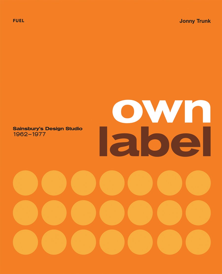
Book Review: Own Label: Sainsbury's Design Studio 1962-1977
Design nostalgia
Sainsbury's is one of the top five supermarkets in Britain. Founded in 1869 as a grocers, it opened its first supermarket in 1950, then it was called a self-service store. The company has always tried to live up their slogan: good food costs less at Sainsbury's.
The book celebrates the unique look of their packaging, essentially very simple designs, flat colors and clean typography. The own label graphic style burst upon the Nation's shoppers thanks to an enlightened management and Art Director Peter Dixon who started the in-house design studio in 1963.
The nicely produced paperback includes well over a hundred packs mostly shown in a flat-plan format with the rest as individual still-life shots. What did strike me though when seeing so many of these packs in one place is how, despite a simple design format, they looked so varied. The really successful ones, it seems to me, have an illustration, either a photo or graphic. On page 179 seven can labels for pet food look as fresh today as they did in 1976. A simple silhouette of a cat or dog gives them such a lift. Page 159 shows a pan scourer pack with a the simple graphic of a pan and simple typography. Page 42 has two crispbread packs with graphics for rye and wheat. These are all brilliant pack designs that clearly stood out on the shelves, especially against alternative products with their brash designs.
Why some sort of illustration wasn't used on more of the designs seems strange because the pure type and colour panel packs frequently come across as trying too hard and some look positively uninspiring. The Instant hot oat cereal (page 45) and Mixed dog biscuits (page 176) have a feel of an art school project. Peter Dixon is quoted as saying each of his design team had to produce an average of two and half packs a week. With that sort of turnover there are bound to be some duds.
I noticed another interesting thing about the packs. The changing style of Sainsbury's logo. Dixon says it was Venus Bold Extended, always as caps on the exterior signage of their supermarkets. Looking through the pages you can see various faces used: Helvetica and Helvetica Medium; Venus light, bold and bold extended. Either in caps or lower case and some with rather ugly letter spacing, too.
'Own label' is a delightful book of design nostalgia for any Brit designers who might come across it. The pages are full of packs that surely must have been in every middle-class household across Great Britain
Own Label: Sainsbury's Design Studio 1962-1977 is available at Amazon (US | CA | UK | DE | FR | IT | ES | JP | CN)

Imprint and title pages. An illustration would have worked well in all this empty space.


Right: seven pet food labels that still look fresh today.


Spread from Emily King's front of book essay.

Left: two lovely simple packs.

The famous Sainsbury's cereal packs.


Simple pack graphics that work.

Visit Amazon to check out more reviews.
The links below are affiliate links, which means I earn some commission from each purchase, but at no extra cost to you.
Here are direct links to the book:
Amazon.com | Amazon.ca | Amazon.co.uk | Amazon.de | Amazon.fr | Amazon.it | Amazon.es | Amazon.co.jp | Amazon.cn


Add new comment