Book Review: Regular: Graphic Design Today
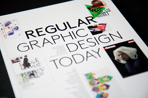
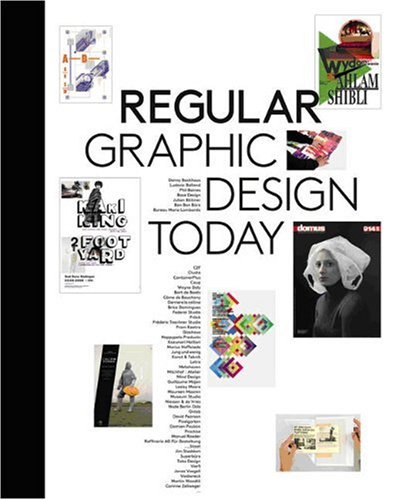
There's probably nothing regular about the designs featured in this book.
The bulk of them are highly experimental, extremely experimental if I must say, constantly challenging you to remember the design principles.
The variety of work featured is incredible. These aren't designs that are geared towards editorial design -- neat alignments and good use of white space.
What stands out is really the typography, amidst the different sections like poster, geometry, editorial design, spatial. There's an insane amount of usage of typography, ranging from the specially chosen fonts to handcrafted ones to highly manipulated ones.
There seems to be no rules holding back the creativity of these artists. So while everything might seem fresh, I can't really pick out any particular strong piece. But because of the amazing diversity of work, this is a good book for ideas and inspiration.


Visit Amazon to check out more reviews.
If you buy from the links, I get a little commission that helps me get more books to feature.
Here are direct links to the book:
Amazon.com | Amazon.ca | Amazon.co.uk | Amazon.fr | Amazon.de | Amazon.co.jp


Add new comment