5 Questions for Matt Busch

In this installment of 5 Questions, we have entertainment illustrator Matt Busch with us.
He's a veteran who has created art for the entertainment industry for two decades. Some projects he worked are titles like Star Wars, Indiana Jones, and Lord of the Rings. He has also provided zombie art for titles such as Night of the Living Dead, The Walking Dead, and Gene Simmons' House of Horrors.
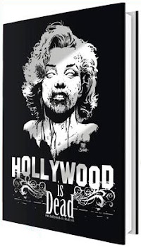
Speaking of zombies, he's current running a Kickstarter campaign for his Hollywood is Dead artbook. You can get the artbook by backing his campaign on Kickstarter at kck.st/16QqchF. It ends on 29 Nov 2013.
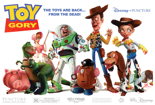
Hollywood is Dead started out as a fun art project with Matt turning classic movie posters into zombie editions, very much like Mad magazine parodies. There's plenty of dark humour going on and the book's definitely worth checking out.
Alright, here are the 5 questions:
Qn 1. You've re-interpreted so many movie posters. Which is the poster that's most fun to turn into zombie version? Why?
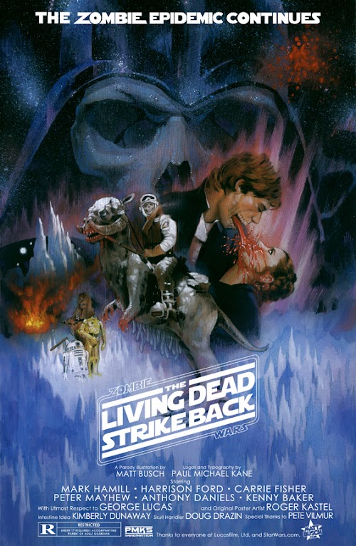
I think the one that had me giggling all the way through, and seems to have gotten a lot of response, is the one I did based on Star Wars: The Empire Strikes Back, originally illustrated by Roger Kastel.
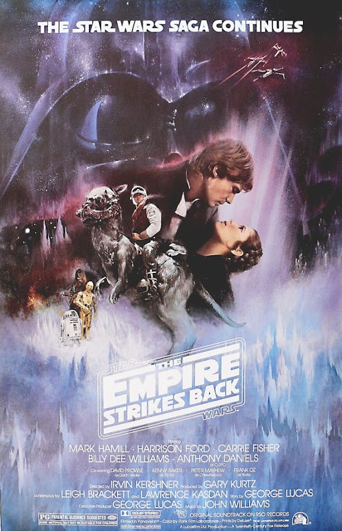
The original is so romantic and whimsical, so my zombified take is just so... Wrong! Yet, that's kind of the point. The original poster is so beautiful and nostalgic for me. I'm really just having fun. If I can get just one other person to giggle, I feel like my job is done.
Qn 2. Can you tell us some of your favourite original movie posters, and why they are so?
There are so many! But here are 3 of my favorites.
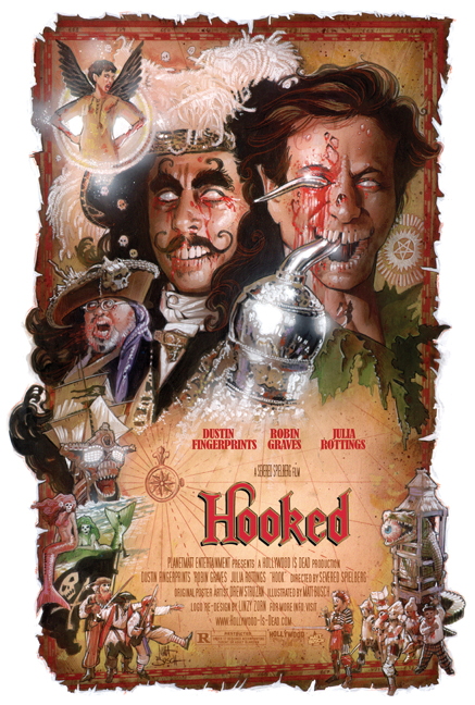
1. HOOK, by Drew Struzan.
In my mind, this is a perfect movie poster, and is completely original.
There is so much detail and fun stuff to look at throughout. And I love that the background is a mysterious map to Neverland! Brilliant! It's also ingenious how he purposely put the most contrast in the ball of the hook, which re-enforces the shape of the hook and the way your eyes follow around the poster.
I felt kind of bad parodying it the way I did, because the original is just so wonderful. But I had a blast working on it and feel like I learn so much studying these.
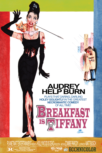
2. BREAKFAST AT TIFFANY'S.
This one is just so iconic. Is there a person in the world who hasn't seen this poster, or who doesn't know someone who has it framed in their house?
With each of the movie posters I parody, in addition to zombifying the art, I have to be creative with the title, which is have the trick, as I can't just keep the the title the same name. I think I struck gold with this one call it "Breakfast IS Tiffany."
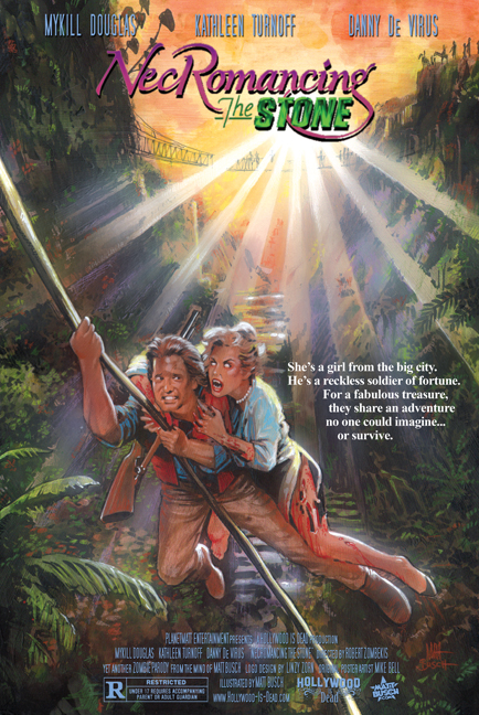
3.) ROMANCING THE STONE, by Mike Bell.
This poster probably has the most nostalgia for me. For some reason, I clearly remember staring at the movie poster and cardboard displays at theaters for hours as a young teen. I remember thinking how amazing the painting was. I also thought it was interesting — as much as I have always loved the montage poster which has multiple elements to convey a complete theme, this poster was more of a scene. But the way the jungle chasm is so vast, it really just made my young imagination filled with wondrous adventure. So studying this piece was really gratifying.
Qn 3. What kind of mistakes have you seen on original movie posters that you've worked on so far?
I haven't seen as many with this project, because for the most part, the posters I've chosen to parody are ones that I think are fantastic. That said, one of the interesting things you'll see when going through the Hollywood is Dead coffee table art book is the history of movie posters as an art form, as they are presented sequentially by year. So of course they start off really creative and well-designed, and eventually for more modern posters, the quick PhotoShop jobs were all I had to choose from!
Most say that the modern lacklustre posters is a direct result of digital media. And there may be truth to that, but I think the current lukewarm designs are more a reflection of the industry itself and the movies they're promoting. Classic illustrated posters were designed to create a timeless image that represents the emotion of the film- something one takes with them, as people often remember their movie-going experience with the single image: the poster that promoted it!
Today, movies come and go very quickly, so to the studio, it's all about grabbing the quick dollars while they can. It's not about the emotion or the timeless story, it's about having the A-List actors standing there to take your dollars before the next ones move in to take their place.
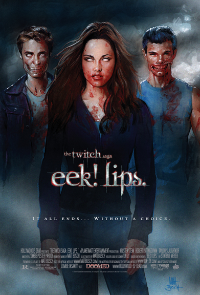
Qn 4. I read in your biography that you have dabbled in a lot of things when you were young. How do you manage your time nowadays?
What my career has become couldn't be more perfect for the creative needs I longed to pursue as a kid.
When I was young, I was always told to choose one thing to be good at get a career in, as doing more than that would spread myself too thin and be career suicide.
Obviously, with technology and the speedy pace of today's industry, the more creative hats you wear, the more valuable you can be.
Technology is eliminating the middle man. Record company execs (for example) are becoming a myth, and the power is going straight to the artist's hands, thanks to social media and of course wonderful crowd-funding sources like Kickstarter. This let artists not only produce the work they want without the corporate filter, but they also reap more of the success without companies taking most of the credit, and money.
While the good news is that this exploding technology opens so many doors to us, it also opens the same doors to everyone! We all have the power to get any information we want within seconds by asking Siri on our iPhones! With all of this information to do anything we want, it's easy to get overwhelmed and not even know where to begin.
So the trick is to be smart about your time. It's not about working harder, and it's not about working longer hours, it's about working smarter. And time management is everything. If I have 15 minutes before I have to leave somewhere, that is great! There is so much I can accomplish in 15 minutes if I'm smart about it.
Qn 5. Hollywood is Dead is a personal project for you, and it was very well received. What advice would you give to someone who wants to create a successful project or creator content?
There are kind of 2 key elements to finding success with their projects, and many have one or the other- but to find success, you need to have both! One is to really put forth the time and effort to make a great product... something that you would support and spend your hard earned money on as a fan. The second is to spend just as much effort promoting it and getting the word out there.
I know lots of incredible artists that do such amazing work, but if they never knock on anyone's door, no one will ever see their work. This is a huge problem, as most artists (myself included) are introverted. By nature, I am not the life of the party. If you've seen my videos, it may look that way, but I really have to push myself to mingle and wear my brand proud... Because if I don't stand behind my art with passion, who else will?
You also have the flip side of this. I know lots of artists or wannabes that spend all their time networking and promoting, which normally is good, but they don't have a solid enough product or even a product at all. If your work isn't honed and your very best- if you don't have a glossy package ready to go, then your time would be better spent getting it together before knocking on doors and sharing it with the world. You don't want to waste people's time. If you badger people, only to show them work that isn't your best, or not anywhere complete, that's your impression you're leaving behind. It'll leave people more close-minded to give your work a look next time.
Advice for crowd-funding projects? This book is my first, and I did a ton of research before going in. I spent months building as much as I could so that the campaign would run smoothly once it started, as I had read from so many that you will have so much to do when the campaign fires off. And they were correct! Nothing could prepare me for how much I didn't have together that I could have before the campaign began.
So it's been an exciting learning experience. I had been planning mine for over a month, but there are plenty of things I realize now that I could have planned ahead of time, enabling me to promote more during the actual campaign. But so far, so good. It's been a 5 year project, so to cap it with this fun Kickstarter experience is really rewarding! I'm having a blast, and I hope you all enjoy checking out the book!
You can find Matt Busch at quite a lot of places online:
www.MattBusch.com
www.MattBuschStore.com
www.FaceBook.com/MattBuschArt
https://twitter.com/Matt_Busch
www.Aladdin3477.com
www.Hollywood-is-Dead.com
www.MattBusch.de
Once again, be sure to visit his artbook Hollywood is Dead at https://kck.st/16QqchF. It ends on 29 Nov 2013.


Add new comment