Book Review: The Vignelli Canon
A little primer on how to communicate with elegance and clarity
If you think designing is just a nine to five job and then you just switch off this little book isn't for you but if you think that creativity can provide an immense amount of intellectual satisfaction then this Vignelli Canon is certainly worth a read.
The author was Italian born in 1931 and originally studied architecture, a discipline that has fundamental rules and if they are not followed buildings fall down. Nothing so drastic happens if you don't follow some of the basic design rules in these pages, you'll just end up with a dull looking bit of print (and possibly an annoyed client).
His views on design reflect a European perspective and you might think rather radical. This is what he says about pc type:
'The advent of the computer generated the phenomena called desktop publishing. This enabled anyone who could type the freedom of using any available typeface and do any kind of distortion. It was a disaster of mega proportions. The computer allowed anyone to design new typefaces and that became one of the biggest visual pollutions of all time'.
Or this on paper sizes:
'The international standard paper sizes, called the A series, are based on a golden rectangle, the divine proportion. The A4 (210 X 297 mm) is extremely handsome and practical as well. It has been adopted by many countries and is based on the German DIN metric standards. The United States uses a basic letter size (8.5 X 11 inches) of ugly proportions and results in complete chaos with an endless amount of paper sizes. It is a by-product of the culture of free enterprise, competition and waste. (Just another example of the culture of greed, irresponsibly offering more options than needed)'.
The book is divided into two parts: The Intangibles and The Tangibles. The first looks at the theory and intellectual underpinning of design in the broadest sense but also, nicely I thought, how it relates to print. In just thirty-six pages Vignelli manages to sum up some broad concepts that others take a whole book to reveal.
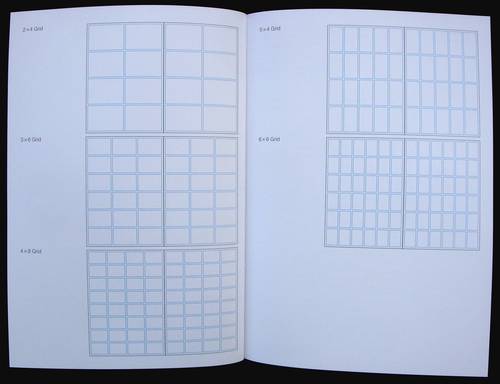
Part two: The Tangibles is a much more practical look at the nuts and bolts of print design. There are some very sensible points made here, especially about typography. Like most professional designers who have been working for decades a limited selection of faces is all that is needed. Vignelli says he can do most jobs with six and certainly no more than twelve. His basic six include: Garamond; Bodoni; Century Expanded; Futura; Times Roman; Helvetica. Basically who needs more than this. Another interesting section in The Tangibles looks at grids. An area that plenty of designers seem unable get to grips with. Vignelli explains their use and shows examples of books and letterheads he's designed. Throughout the book there are plenty of photos and simple graphics to support the text. Most of this material has been produced by his studio.
I enjoyed this book. It's stimulating and thought provoking but it's worth saying that the contents are not a how-to-do-it about design, though it does provide some very specific pointers. Vignelli provides a design scaffolding so that you can complete the structure with elegance and clarity.
The Vignelli Canon is available at Amazon (US | CA | UK | DE | FR | IT | ES | JP | CN)


Visit Amazon to check out more reviews.
The links below are affiliate links, which means I earn some commission from each purchase, but at no extra cost to you.
Here are direct links to the book:
Amazon.com | Amazon.ca | Amazon.co.uk | Amazon.de | Amazon.fr | Amazon.it | Amazon.es | Amazon.co.jp | Amazon.cn


Add new comment