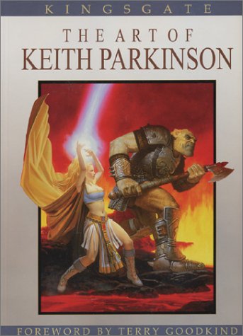
Book Review: Kingsgate: The Art of Keith Parkinson
This print above appears in the book Polgara the Sorceress, a book I read more than a decade ago and I still remember it after all these years.
Keith Parkinson is a fantasy genre illustrator using traditional medium. He has created countless illustrations for fantasy books, games and other commissions.
His costume design for characters looks natural and most importantly always believable for required fantasy setting. After looking at the costume language, I probably can't imagine the characters wearing anything else. It just feels right.
Majority of the paintings are on human characters, and the very few monsters illustrations look great too. There's a good physical form to all the characters he drawn.
For book covers printed on small novels, the amount of detail put into the paintings is amazing. I guess it's the level of detail that gives his illustrations that level of realism.
It is also interesting to observe the type of composition used in book covers. The characters and action are always stage inside the frame. Rarely are any characters cropped. It does feel strange if not told that most of them are covers.
You can see more of Keith Parkinson's work at www.keithparkinson.com
Kingsgate: The Art of Keith Parkinson is available at Amazon (US | CA | UK | DE | FR | IT | ES | JP | CN)


Visit Amazon to check out more reviews.
If you buy from the links, I get a little commission that helps me get more books to feature.
Here are direct links to the book:
Amazon.com | Amazon.ca | Amazon.co.uk | Amazon.de | Amazon.fr | Amazon.it | Amazon.es | Amazon.co.jp | Amazon.cn
Comments
Ha! Yeah, I remember that
Ha! Yeah, I remember that Polgara-book as well :)
I find Parkinson to be one of those classic fantasy illustrators that do good work, but his art doesn't actually stand out. Not sure if that's an advantage or not - I guess it could get him a lot more work, especially in a field like book or game cover illustrating. Then again, art that's a bit more rough and with visible brush strokes, etc. grabs my attention more easily these days.
He doesn't stand out probably
In reply to Ha! Yeah, I remember that by nysv (not verified)
He doesn't stand out probably because of the type of composition required by book covers. It's definitely not his techical skills because the quality is obvious.


Add new comment