Book Review: Graphic Design: Now In Production
Who wants to read an unreadable book?
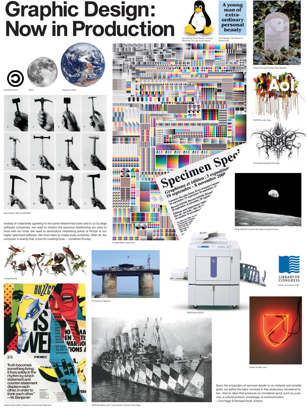
The title is based on a touring exhibition of print design originally held at the Minneapolis based Walker Art Museum. The 224 pages are really in two parts: twenty essays by various industry commentators, educators and designers are in self-contained pages and I found some these quite thought-provoking, especially the one by Michael Rock and the three from Ellen Lupton. Perhaps it's unfortunate that several essays fall short of their allotted page space and columns are just left empty at the end.
The second part is where I think it all comes unstuck. These are the image pages that follow each essay. They have hundreds of printed examples crowbarred into each page (it's meant to follow the style of a Paris salon) with their captions set in five point and chunky blocks of copy set in 6.5 on 8 point type. These text blocks, some of which contain hundreds of words, have no paragraphs instead a pilcrow is used to tell the reader where a new par starts. There is no common line-length throughout the book for these blocks of tiny type, it just slots into what space is available and amazingly lots of them are set sideways (page 206 has six lines over 10.5 inches). To expect readers to put up with this is a nonsense in a book on communication.
Perhaps a clue to this sloppy editorial can be found on the Colophon page part of which says: `This premodern style of arrangement, which attempts to impose an order and sensibility on an often incoherent assemblage of objects, speaks to our contemporary condition of information overload in an increasingly fragmented search-based culture'. As an attempt I think it fails dismally.
If only the contents of this book had been presented in a format based on visual clarity and ease of reading it would have got five stars from me.
Graphic Design: Now In Production is available at Amazon (US | CA | UK | DE | FR | IT | ES | JP | CN)

Imprint and Contents, clean and readable though without some graphic content it does look rather bland. If only the rest of the book was as easy to read.

Bottom left: Throughout the book on the image pages copy is set in 6.5 on 8 point and with no paragraphs, instead a pilcrow is used. Some of these text blocks include hundreds of (more or less) unreadable copy. Captions are set in 5 point!

Michael Rock raises some interesting points in his essay. The book's rather inflexible grid means that copy just falls short, as on the third column on the right-hand page.

Top right: As this text on the image pages is sort of unreadable because of the tiny type why not turn lots of the text blocks sideways on many pages.

A spread with a bit of breating space and reasonably sized images, unlike the rest of the book.


Left: 65 lines in one block of 6.5 on 8 point and no pars.


Text on either side of the images with a line length of 10.5 inches and turned sideways.


Visit Amazon to check out more reviews.
The links below are affiliate links, which means I earn some commission from each purchase, but at no extra cost to you.
Here are direct links to the book:
Amazon.com | Amazon.ca | Amazon.co.uk | Amazon.de | Amazon.fr | Amazon.it | Amazon.es | Amazon.co.jp | Amazon.cn


Add new comment