Review: Super5 Calligraphy Fountain Pen

A sketching friend Omar Jaramillo sent this pen over to me for review.
Super5 is a relatively new brand of fountain pen that's made in Germany. I've not heard of this brand before. After searching online, it seems that this is the only pen they sell, with variations only to the colour (orange and black) of the clip.


It has a 0.5mm calligraphy nib and is marketed as a calligraphy fountain pen pen. However, because the nib's only 0.5mm wide, the calligraphy strokes are not that obvious. Personally, I would not consider it to be suitable for calligraphy work.


The barrel and cap are made of black plastic while the metal clip is painted yellow. Interesting colour combination. It's a click-on cap.

The grip is metal painted with a coat of low gloss black. It's a typical standard size fountain pen but it's quite heavy because of the metal grip portion. The weight actually makes the pen feel a bit weird. When the exterior of the pen is made of plastic, it would lead you to expect a lightweight pen but it's not. Weight is a personal preference anyway. At least when writing, it's front heavy so the balance is still alright.

Here are the strokes from the Super5. Downward strokes are thicker than the side strokes.
Ink flow is alright but could be more generous. I was using Noodler's Ink. The same ink on another pen with better ink flow would appear darker. Super5 produces black that's slightly toned down because there's less ink coming out.
Stroke variation is not significant but noticeable if you look out for it. The thin stroke is probably about 0.3.

Here's a sketch with Noodler's Ink on smooth paper. Some blobs formed because of the lousy paper.
These three below, including the hatching lines, are on smoother paper. The ink here is darker because the paper allows the ink to flow out more easily. You should view the drawings on fine grain cartridge paper (further below) for a more accurate impression of the strokes.

The ink's very dark however it's not representative of the pen's performance on less-than-extreme-smooth paper.


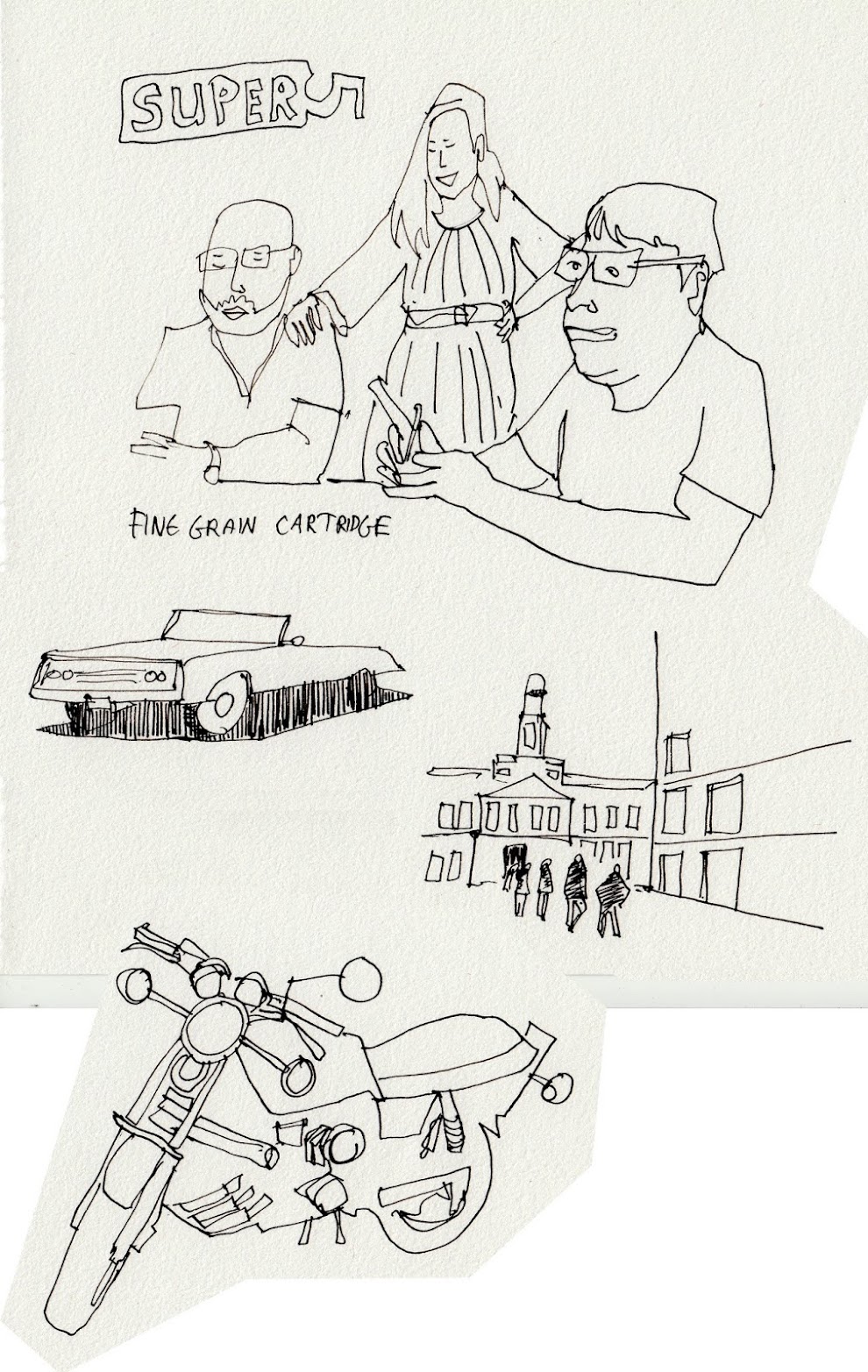
These two below are drawn on fine grain cartridge paper, again with Noodler's Ink. This is a more accurate impression of how the lines will look on typical paper such as your notebooks. The lines are more consistent without any blobs.


The nib is smooth enough but there's still feedback from the paper. Downward strokes are smoother. The smoothness is quite similar to Lamy Safari which is another fountain pen in this budget category. However, the Super5 is nowhere as smooth as nibs from the budget Kaweco fountain pens.

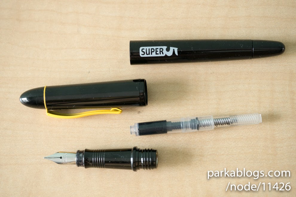
Here's how it looks all dismantled.
It comes with a converter. When you first put it in, it's really tight. And when you screw the body on, it feels like you're pushing the back of the convertor. It's fine after the converter is fitted. I think it's the same converter used in Hero fountain pens.
Conclusion
The Super5 fountain pen gives me mixed feelings.
The grip section feels industrial because of the weight and the painted metal. The colour of the yellow clip on black feels a bit weird and unlike any many other fountain pens out there. I like the shape of the pen design because it's quite similar to the torpedo shaped Sailor 1911 Profit. The logo looks a bit cartoony. Performance-wise, I wished it had much better ink flow though, not that I've ever experience it skipping, but it's just that with better ink flow the lines would be darker. This pen works better on smoother paper that helps with the ink flow.
It's an affordable pen so I can still accept the many quirks that it has.
Availability
You can find the Super5 fountain pens on Amazon with these direct links: US | UK | DE

Add new comment