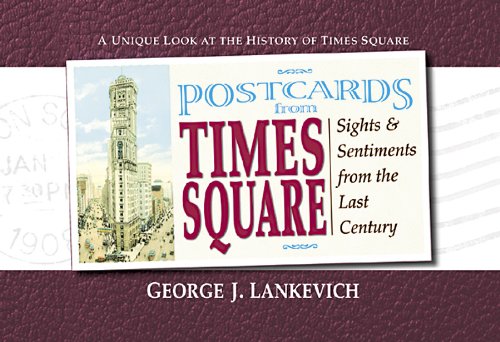
Book Review: Postcards from Times Square: Sights & Sentiments from the Last Century
Neon crossroads
There aren't too many places in the world that have a buzz 24/7. Most other places, sensibly, decided long ago that a rest is required now and again but Times Square just keeps on going. Because its been popular for decades a book of just postcards about this theater, restaurant and tourist heaven would seem obvious.
The 130 postcards cover it all and George Lankevich has dug around for some interesting stories and facts but I think it's the cards that really provide the interest, especially the early historic ones. Unfortunately this fascinating trove of colorful ephemera gets a pretty second-rate look-in throughout the pages. Several types are used for the text, some pages have two columns others three, headings and short intros are printed over photos and color panels run through blocks of text for no reason. There is a waste of twenty-five pages which reproduce the address side of postcards so you can read (sometimes with difficulty) what the senders said. Some of these comments are interesting on the first read but after that they're redundant.
Flick through the pages and you might wonder if the publishers wanted the book to look as bold and brassy as Times Square itself. A pity because with a more thoughtful design all these postcards could really have worked a treat and made a super book.
For a really handsome looking book about the Great White Way check out Times Square Style: Graphics from the Golden Age of Broadway. Published in 2004 it reproduces hundreds of graphic items to really capture the exuberance of the place.
Postcards from Times Square: Sights & Sentiments from the Last Century is available at Amazon (US | CA | UK | DE | FR | IT | ES | JP | CN)

The much more considered book by Vicki Gold and Steve Heller.

Title spread, with a whole load of empty space that should really have had some sort of image.

A light blue panel runs into the Rockefeller Center photo with text overprinted on the the panel and photo. How messy can a page get?


Left: I can't see any reason for the light brown panel on the bottom half of the page.


One of the twenty-five postcards printed so you can read the comments. I thought this was a wast of these pages.


A spread of postcards from the 'Times Square Style' book. A straighforward layout that lets the cards speak for themselves.
Visit Amazon to check out more reviews.
If you buy from the links, I get a little commission that helps me get more books to feature.
Here are direct links to the book:
Amazon.com | Amazon.ca | Amazon.co.uk | Amazon.de | Amazon.fr | Amazon.it | Amazon.es | Amazon.co.jp | Amazon.cn


Add new comment