Results for Drawing Contest #3: Lost
This round has less participants, which means I had a relatively easier time uploading all the pictures. Thanks for the participation.
Drawing contest #3 is on Lost, the TV series.
The winner is...
Winner
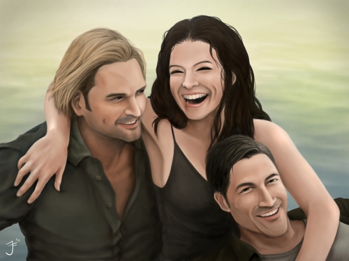
Antonius Jeffrey
I was split between three pieces, from Antonius Jeffrey, Oscar Fabián Triana Méndez and Mike Sekowski. In the end, I used a random number generator to pick the winner.
I thought the piece by Antonius Jeffrey had great mood, three characters sharing a happy moment together, something that's quite hard on the island.
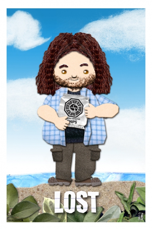
Oscar Fabián Triana Méndez created his piece in traditional medium, cutout cloth and paper. The textures are very nice, especially the hair and clothes, and the leaves.
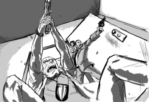
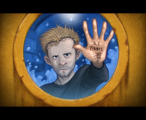
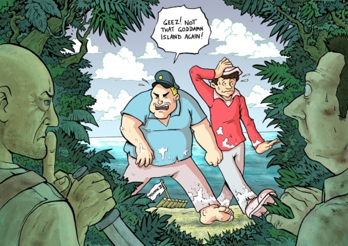
And then there's the cool dark concept art-style painting by Mike Sekowski. Be sure to check out his blog.
For those who didn't win, stay tuned for more drawing contests in the future!
Update: Since I've extra budget for this contest, I'll put in another winner, Mike Sekowski, fans' favourite. Yeah!
Entries
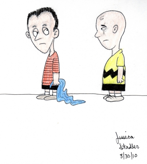
These are the entries, in order of submission.
Clicking on the images will give you a larger view.
Comments
Seriously, the one made by
Seriously, the one made by Mike Sekowski it's the very best.
Agreed. Mike's is very
Agreed. Mike's is very professional and well laid out -- a gorgeous digital piece.
To be honest, Mike Sekowski's
To be honest, Mike Sekowski's artwork is the best one as the tones and atmosphere very well match with the real Lost life. Not to mention how incredibly detailed the whole piece was! I found it to be very stellar.
Nonetheless, congratulations to the winner.
Well, I do have some extra
Well, I do have some extra budget for this contest so I'll put in another winner.
PARKA YOU GOTSTA HAVE ANOTHER
PARKA YOU GOTSTA HAVE ANOTHER DRAWING CONTEST!!!
PLEASE I ASK YOU!!! PLEEEASE! hahahaa
Mike Sekowski should have
Mike Sekowski should have totally got the first place
you can see the airbrush and the simple copping of a photo screaming in Antonius Jeffrey work , i am sorry to say you made a horrible mistake!!!!!!
Yep, Mike's piece is the
Yep, Mike's piece is the best, even if I entered the contest I would have voted his work for sure, mostly because, time-permitting, I would have loved to do something like that myself (probably not with the same results).
I like Oscar's piece as well, because it's really unique, and very well executed too.
The winner is nicely rendered
The winner is nicely rendered but its also just a copy of a Vanity Fair photo.
Georgio Viola, Mike Sekowski and Oscar Fabián Triana Méndez' are all outstanding
im not a big fan of mikes,
im not a big fan of mikes,
its great, but to me
it looks like some kind of photoshop trickery!
and i dont like blurred objects..
"it looks like some kind of
"it looks like some kind of photoshop trickery!"
yes, the trickery is called great control of digital painting techniques.
it's a common "trick" we use. we just open photoshop and type "great painting" and it's done.
hahaha i didnt mean it like
hahaha i didnt mean it like that
buut ive just seen some people, how they use layers, over a
already done image, and just kinda go over it..
i did say it was great, but just not my cup of milo..
but starspire, i have no idea how photoshop works, but,
so did he literally sit there with a blank page and start drawing
every single thing on that picture without tracing or anything??
im just asking coz i have no idea..
hay mang im sorry if i offended you or mike..
Wow, the three pieces you
Wow, the three pieces you chose were really cool! Even Hurley look cute in Oscar's piece, lol...
Congratulations to the winners and participants!






Add new comment